


Why Colour Changes How Big a Room Feels
Architecturally, living room colour ideas can change a room’s scale, distance, and proportions without changing its physical dimensions. They manipulate wavelength processing, light reflection, and contrast. This changes how we perceive brightness, depth, and visual openness.
When we enter some rooms, we feel them large because of the colours. Know how that works? It works because of light-reflective tones (pure whites, warm ivories), cool receding hues (soft blues, pale greens), and monochromatic schemes (single colour family). Some effective colour combinations can also work. They include airy neutrals with soft accents (Perfect ivory X Natural Sage), tonal contrast for depth, and colour drenching. To balance brightness and comfort, avoid bare sterility, use satin or eggshell finishes, and add complementary textures.
Light Reflectance Value (LRV)
LRV is a measure of the percentage of visible light that a surface reflects or absorbs. It is scored on a scale from 0 to 100. A score of 0 shows an absolute black surface that absorbs all light and reflects nothing. A score of 100 shows a theoretical pure white surface that reflects 100% of the light. A score of 50 is a general midpoint. Above 50 shows that the colour reflects more light than it absorbs, while below 50 absorbs more light than it reflects. Light colours with higher LRV reflect more light, making a small room look brighter and more spacious. Dark colours with lower LRV absorb more light, making a room feel smaller.
Warm vs Cool Undertones
The difference here is the hidden secondary pigments. They determine how a colour feels, how light bounces off it, and a room’s emotional mood.
Warm Undertones
These include beige, cream, and peach. They contain pigments of yellow, orange, red, brown, or gold. They give a cozy, inviting, soft, and energising vibe. They also make the sparse rooms feel more intimate and grounded. The best pairings include warm wood furniture, brass or bronze hardware, terracotta accents, and earthy textiles. Ideal rooms and light include living rooms, kitchens, and north-facing rooms that lack direct sunlight and need a warming boost.
Cool Undertones
These include blue, green, and grey. They contain pigments of blue, green, violet, or silver-grey. They give a crisp, clean, calm, airy, and serene vibe. They also make small or tight rooms feel larger and more open. The best pairings include cool marble or stone, chrome or black accents, glass, and minimalist Scandi or contemporary decor. Ideal rooms and light include bedrooms, bathrooms, and south- or west-facing rooms that receive intense sunlight and need balancing.
60-30-10 Rule for Small Rooms
This classic interior design formula balances colours to give a harmonious feel. It works best for small rooms, as it prevents tight spaces from looking overwhelmed. Choosing the right living room colour combination based on the 60-30-10 rule creates a balanced look and maintains visual openness. The rule is split into 60%, 30%, and 10%. 60% is the dominant or foundation colour. It is chosen for the largest surfaces. The 30% is the secondary or supporting colour. It covers the mid-sized elements. The remaining 10% is the accent or punch or personality colour. It covers the small details and accessories.
How to apply this rule in a small room?
60% – Apply it to walls, large rugs, or major built-ins. Use light, airy, or neutral shades like soft white, warm cream, light beige, or pale grey. It bounces light around and makes the room feel bigger.
30% – Use it for curtains, a small sofa or accent chair, headboards, or a large rug. Choose a deeper, richer colour than your dominant base. Keep the contrast gentle so the eye moves smoothly across the space.
10% – Cover small details and accessories like throw pillows, artwork, a vase, lampshades, or decorative objects. Use a bolder or contrasting colour or a metallic finish like brass or black. For character, and to not shrink the room, apply them in small, restrained doses.
A designer’s design tips can ensure effective results. These include following a consistent colour palette throughout connected spaces for visual continuity, choosing lighter wall colours and limiting bold shades to make compact rooms look spacious, and testing paint samples in both natural and artificial lighting before finalising the colour.
2027 Colour Direction
With days left for the 2027 Pantone colour, five predictions are already up: Luminous Blue, Grounded, Webster Green, Celery, and Soulful Sage. Look out for these colours, because except for Luminous Blue, these shades are directly connected to the 2027 colour direction for interiors.
The ‘green takeover’ has five reasons: combating modern overload, biophilic design principles, beyond basic greenery, tactile and sustainable materials, and personalised sanctuaries. This shift is driven by a growing need for mental well-being, stress reduction, and a deeper biological connection to the outdoors amidst dense urban environments and constant digital noise. The outcomes include counteracting fatigue and anxiety, lowering blood pressure, improving focus, promoting emotional balance, and enhancing personal comfort and emotional restoration.
You can effortlessly incorporate these into your interiors by simply following the 60-30-10 rule.
Spend your 60% by colour-drenching the walls in plaster pinks, warm parchment, oatmeal, and clay. They catch natural light softly and make rooms feel personal and secure. For a deeper neutral foundation, include a wall paneling, built-in shelving, or the wall behind a bed Grounded olive green or Cottage Door gray-blue.
In the next 30%, focus on comfort as a design statement. Include low-slung, casual silhouettes, curved shapes, and deeply cushioned surfaces. Choose Richer Secondary Shades for furniture. For example, in an oatmeal-coloured room, add a deep chocolate brown, moss green, or structural plum sofa. Texture is equally important as colour this year. Reupholster dining seat cushions or single accent chairs in matte, natural textiles like slubby linens, heavy cottons, or rich patinated leathers.
For the remaining 10%, stick to the 2027 accent philosophy – purposeful maximalism. This means applying high-gloss and lacquer contrasts and low-risk accents sparingly but with intense confidence. High-gloss and lacquer contrasts include Luminous Blue or rich Oxblood red through high-contrast finishes. Apply them for a single high-gloss bar cabinet, a lacquered nesting table, or a reflective ceramic lamp. This adds sudden energy to an otherwise earthy, matte room. Low-risk accents repeating your 10% accent colour exactly three times in small doses. For example, pair a couple of vibrant pillows on your neutral sofa.
Whatever 2027’s Pantone colour and colour direction may be, Kerala’s architecture has a certain colour palette to follow. Light, breathable colour palettes. They act as natural cooling agents and visual bridges, transforming warm, humid interiors into open, airy sanctuaries. They optimize natural air currents and daytime light, creating balanced, climate-smart living spaces.
Additionally, Dulux’s Colour Team released their 2027 colour of the year, Soulful Sage, along with three interior design palettes: sensory, play, and treasure. Sensory features botanical greens, earthy browns, and soft coastal blues. Play blends cheerful pastels with vibrant berry, orange, and navy accents. Treasure combines deep berry and violet-reds with warm gold, teal, and coral-pink tones.
2 Colour Combinations That Work
These living room colour combinations for small spaces offer practical ways to make compact interiors feel brighter, more spacious, and visually appealing. From warm neutrals and earthy greens to soft blues and subtle metallic accents, each palette brings a different character to your living room.
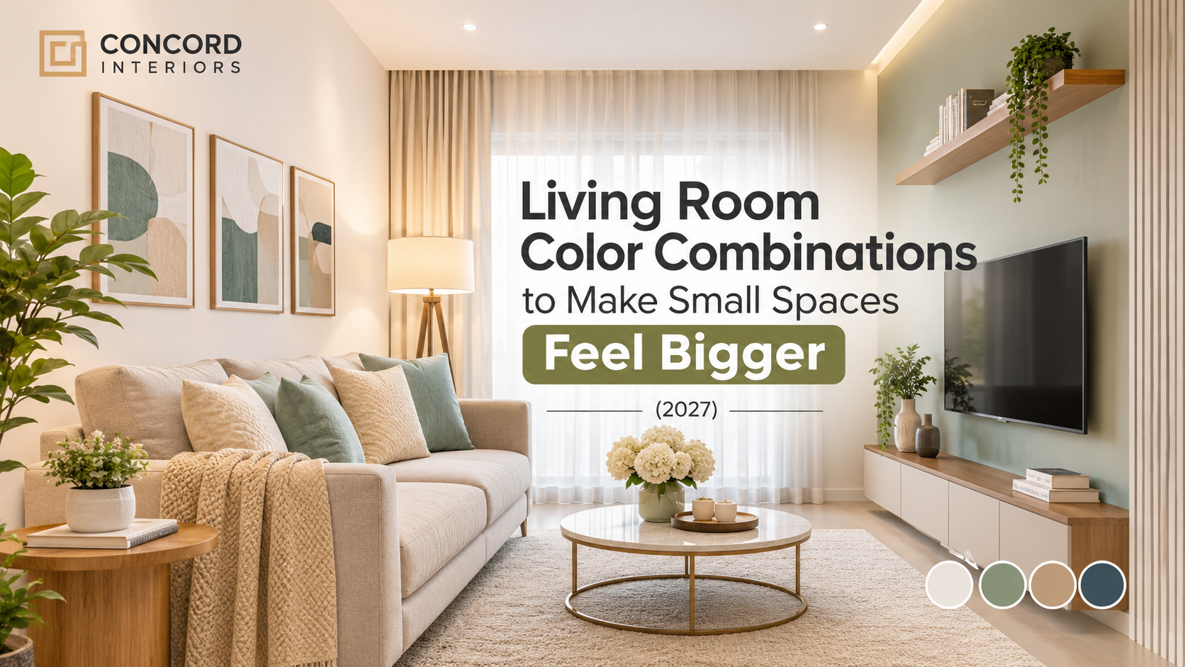
1. Warm White + Sage Green + Natural Wood
Warm white creates a bright, welcoming base, while sage green adds a calming natural touch. Natural wood brings warmth and texture to the space.
2. Soft Beige + Off-White + Brass
Beige and off-white create a soft, elegant look. Brass accents add a subtle touch of luxury.
3. Pale Grey Blue + White + Light Oak
Pale grey-blue introduces a cool, refreshing feel, while white keeps the room bright. Light oak adds warmth and balance.
4. Tonal Monochrome
Using different shades of the same colour creates a coordinated and sophisticated look. Varying textures prevent the space from looking flat.
5. Cream + Terracotta Accents
Cream creates a warm, neutral foundation, while terracotta adds an earthy, rustic character through décor and accent elements.
6. Light Greige + White Trim + Black Details
Light greige offers a balanced neutral base, white trim creates definition, and black details add contrast and a modern touch.
7. Pale Mint + Ivory + Cane
Pale mint introduces a fresh, soothing appearance, while ivory keeps the room light. Cane elements add natural texture.
8. Soft Blush + Warm White + Muted Gold
Soft blush creates a gentle, inviting atmosphere, warm white maintains brightness, and muted gold adds understated elegance.
9. Light Sand + Stone Grey + Olive
The earthy shades create a grounded, nature-inspired palette. Olive adds depth, while sand and stone grey maintain balance.
10. Powder Blue + Cream + Walnut
Powder blue creates a calm, airy feel; cream softens the overall look. Walnut adds richness through wooden furniture or finishes.
11. White + Light Grey + One Bold Feature Colour
White and light grey create a simple, versatile backdrop. A bold accent colour adds personality without overwhelming the space.
12. Ivory + Dusty Rose + Soft Grey
Ivory creates warmth, dusty rose adds a subtle romantic touch, and soft grey balances the palette with a contemporary finish.
By now, we have arrived at the point where overly dark colours, heavy contrasts, and busy patterns make a small room feel enclosed, and lighter shades like white, beige, cream, and pastels create an airy, spacious look. Even dark colours can work as accent walls or decorative elements, but you should include three elements properly: lighting, mirrors and finishes, and curtains and furniture.
Lighting
Use natural light wherever possible to make the room feel brighter and more open. Incorporate layered lighting, such as ceiling lights, wall lights, and floor lamps, to reduce dark corners. Choose warm or neutral lighting based on the room’s colour palette.
Mirrors and Finishes
Mirrors can reflect natural and artificial light, creating an illusion of more space. Glossy or reflective finishes enhance brightness. Subtle textures and coordinated finishes maintain a clean, uncluttered appearance.
Curtains and Furniture
Choose light-coloured curtains and hang them closer to the ceiling to create a sense of height. Go for space-saving, multifunctional furniture with simple designs. Match furniture colours with the walls to create visual continuity and make the room feel less crowded.
Colour Planning for Kerala Homes
Three factors are important for colour planning:
Monsoon Lighting – Lighter shades such as off-white, beige, and pastels brighten interiors during cloudy and low-light monsoon days.
Humidity Considerations – Humidity-resistant, moisture-resistant paints and finishes. Avoid finishes that easily develop stains, peeling, or mould.
Apartment Layouts – Light and neutral colours make compact apartments feel more spacious and open. Furniture, feature walls, or décor with darker accent shades create visual contrast.
Ready to transform your home with thoughtfully designed interiors? Book a free consultation with The Concord Interiors team and explore personalized design solutions tailored to your space, lifestyle, and preferences. Visit our Kochi showroom to get started!
